Type: Quick Look
Project Duration: March to June 2017
My Role: UX Designer
Background
The League of Legends Fanart Showcase is a portal where our community can discover and share the most impactful community illustrators and their creative contributions to the League Universe. Our mission was to create a self-sustaining portal where visitors discover, share, and celebrate creators and their exceptional League-inspired works.
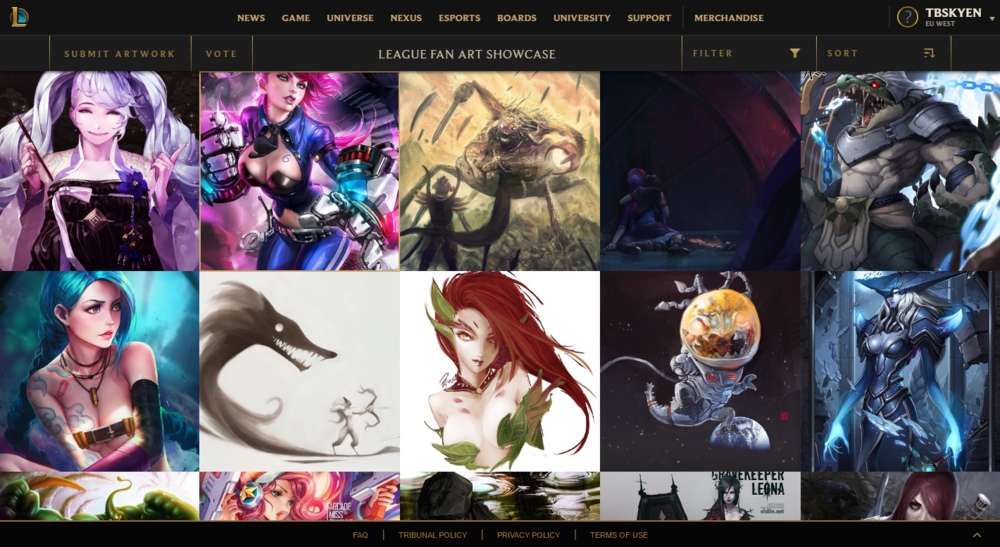
Prior to the current navigation and search flow, users had to discover content primarily through the filter functionality and massive champion grids. There was no proper search function that allowed them to search by champions, artists, or titles of artwork. When a user would favorite fan art piece, there was no clear way for them to view it on the site. Call to actions, such as “Submit Artwork”, were not very visible or clear in the navigation bar.
Original landing page for the League of Legends Fanart Showcase. Champion card grids created visual clutter and made it difficult to navigate the site. In addition, no search bar and relying only on filters to find champions greatly decreased accessibility and discovery of content.
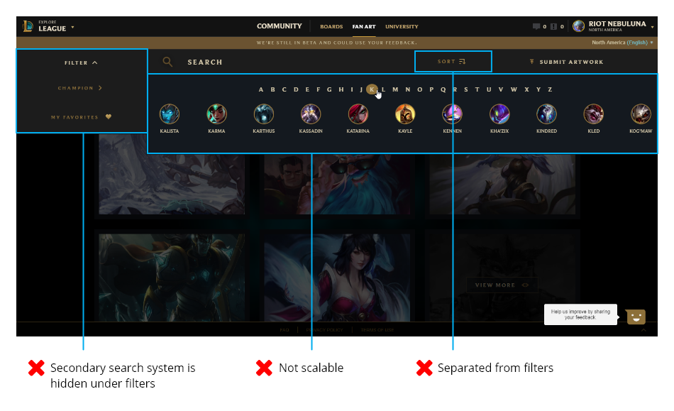
Before I joined the team, a new search function was introduced, allowing for the search of artwork by champion name, but also through the filter system that opens up underneath the search bar based on first letter of a champion’s name. Upon further inspection, I quickly noticed many problems that needed to be solved quickly.
Search results would also highlight letters included in champion names, which results in bloating the search results list to include more champions than the desired search intent. Additionally, call to actions, such as “Submit Artwork”, are not very visible or clear in the navigation bar.
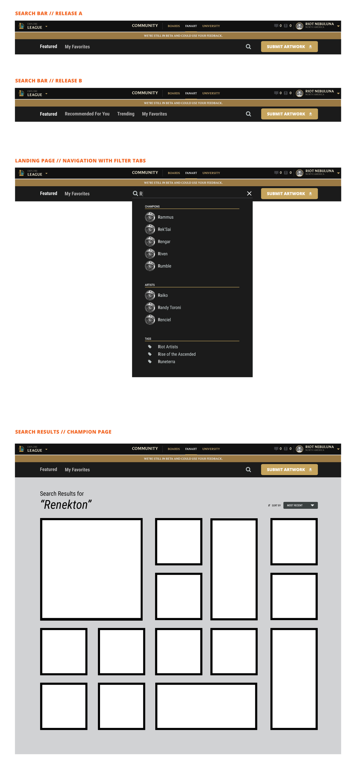
This cumbersome method of navigating the site was not optimal. I redesigned the navigation flow as a way to improve the UX, which resulted in an increase in both engagement and overall satisfaction. Overall page depth went up because I designed an experience that made it easy for a use case to be satisfied (e.g. people searching for a champion specific fanart) and qualitatively our survey respondents found the new navigation intuitive. Additionally, respondents no longer complain that the site was difficult to navigate.
Current Problems
“Currently, I can only search by Champions, but I want to see artwork by my favorite League artists.”
“There are too many options on the search bar which don’t help me find the content I want to see.”
“I want a more frictionless search experience on Fanart.”
Goals
Allow users to intuitively navigate through the site
Give users more options to discover the content they want to engage in
Organize navigation structure and layout
Create a better filtering system by surfacing meaningful categories to users


