
Type: Deep Dive
Project Duration: March to July 2018; January 2019 (Journeys)
My Role: UX Design
Overview
I worked on Explore Runeterra, an interactive web experience built with React and WebGL that helps contextualize the world of Runeterra as a living, breathing place for League of Legends players to discover and explore.
Background
Riot Games did not have a current and definitive player-facing map of the world of Runeterra. None of our stories, comics, events, regions, champions, etc. had any clear spatial context within the world. As a result, many players’ connections to Runeterra were fractured and inconsistent. Players were creating their own maps to fill in what they wanted to know, often times referring to inaccurate sources to base their theories from.
This is an example of the diverse range of player made maps available on the Internet.
We understood that by creating a map, it would be a good way to help players understand spatially a theme or champions by placing them in the context of a location. Maps also helps Rioters align in our storytelling and lets us know where we’re going, and what we’re doing.
Our challenges were to:
Give our stories, events, regions, champions, etc. the spatial context within Runeterra that is missing
Create a scalable system so the map is set to grow over time with the needs of our content experiences
Identify and correct existing UX issues and gaps during the production process
Goals
Players could understand the relationships between places, people, and events of Runeterra.
Players could find content about Runeterra, its main events, stories, and champions in context of region and location.
Riot can publish Runeterra content in context of region and location.
Target Audience
Casual IP Engagers; actively play League of Legends but engages with Universe content opportunistically and needs more points of reference.
Lore Enthusiasts; actively play League of Legends and is up-to-date on lore but wants more context.
The Base Map
In order to make Runeterra as believable as possible, we started gathering all sorts of lore information, such as where mountains were, where rivers were, how people might settle that land, where the borders between all of our factions were located, etc. And while it would have been enough to create an image asset that showed all the locations and region borders of Runeterra, we didn’t think that would be a good use of the digital platform and make Runeterra feel real to players. By placing interactive data points and content experiences and using traditional cartographic data methods to lend depth, realism and authenticity to the world, we believed that it would establish Runeterra as a living, breathing place for fans.
An example of Amanda Jeffrey’s (Riot Bioluminescence) cartography work in support of the Runeterra Map Experience.
The base map was composed of two main system, the map viewport and the content panel. Multiple pieces of content, such as locations, landmarks, champions, and regions were represented by interactive icons. It used a map image tiling system, dynamic height maps, custom shaders for effects, and interactive audio effects.
This was one of the earlier iterations for the interactive map. After conducting usability testing, we learned that the map felt empty without things to interact with outside of locations and champions.
Players could zoom in and pan around to navigate the interactive map and explore different content that was revealed to them per zoom level. The map was optimized for both desktop and mobile devices, and players’ browser must support the WebGL API in order to use it.
Identifying Gaps through Usability Testing
I conducted some high-fidelity prototype user testing and quickly learned that while users felt excited about the product, they had expected to find concept art on the map. They wanted to have the ability to learn more about the world of Runeterra through imagery on each map location. While we wanted to populate the map with lots of lore content, we didn’t want to replicate the current Universe website in a map format by duplicating all player-facing content onto the map. However, by conducting these tests, our assumptions were challenged and we needed a new approach. Conceptual artwork and illustrations that depict important information about Runeterra, such as geographical, environmental, architecture, fauna and flora, etc. needed to be included on the map to help them understand the spatial context they needed when learning about our IP. As a result, we needed to think about the best way to approach this particular problem.
It was clear to me that I needed to make some changes to the current experience to address gaps and opportunities. I sat down with the team to strategize improvements to the base map experience. Together, we came up Image Galleries as Points of Interests and Map Journeys inside Collections.
Focusing on the casual IP engager would guide us in tackling UX pain points from the majority of the audience base (90%) without gating the lore in stories and novellas or ignoring the needs of the lore enthusiasts.
Image Galleries as Points of Interest
Interactive elements on the map had modular rollovers that revealed images, champion avatars, type, and basic descriptions, serving the purpose of the content being revealed to players. Upon clicking an interactive element, the content panel would expand and showcase additional information like location history and region attributes.


Providing two main ways to find lore allowed players to explore Runeterra in a way that would best fit their needs.
Additionally, players can interact with art on the map point of interest (POI) pins. A click (or tap for mobile) on an art POI would trigger a full-modal takeover that displayed the selected POI embedded art.
These groupings of conceptual artwork from regions and other high density location are available on the world and through the content panel. Selecting a gallery triggers the same image viewing experience.
This system showcases all artwork embedded within a location with supplemental captions for each image. Art is stacked vertically down the page with space for image captions located on the right.
Content Audit for Galleries
I knew we could work with content that was already player-facing through Universe, but I really wanted to push further and introduce all this cool and new art that players had never seen before. Therefore, I conducted a content audit for all internal illustrations and conceptual artwork that existed within Riot Games.
I printed every region “foundations sheet” and cut all image and description captions, and grouped them to create galleries based on themed categories.


I found all the Demacian conceptual artwork and grouped them into themed galleries that would be accessible within specific locations on the map or within cities and landmarks.
I learned two main things from doing this content audit exercise. Some of the art lends itself to be placed in specific locations on the map, helping players understand the relationship between the lore and regional location. Stand-alone imagery of the map, such as “Demacian Raptor Knights”, could exist without being in a town or city, but instead somewhere in the mountain regions near Demacia. Additionally, other art pieces felt they would be best experienced as a collection accessible within places on Runeterra, such as the “Military of Demacia”.
I believed that by placing art points of interest on the map and image galleries accessible through the content panel, players could find visual representation of lore meaningful and engaging. These interactive data points and content experiences on the map would serve as additional tools for players to build their theories from and have a clearer understanding of the world.

Screenshot of creating theme groupings with appropriate copy and image per gallery. Using Google Slides allowed me to work more collaboratively with other members of the team with content management and editorial support.
More Rounds of Usability Testing
Once we had something to test, such as the usability or general sentiment towards a feature, I would go ahead and test with a small pool of internal users and analyze that data. Frequent rounds of usability testing with smaller sample pools allowed me to quickly iterate and get to ideal outcomes faster.
In this example of data debriefing, I reported to the team that our iconography was not clear to users and we needed to invest time iterating on clarity concerns with this new feature.
Brush icons were received very well during user testing and were chosen for the final product to best represent image galleries on the map.
Map Journeys inside Collections
Part of the reason why we wanted to build the interactive map was to empower narrative teams to publish campaigns and stories in context of region and location. We believed that using the map to tell curated stories that involve multiple locations was a powerful and unique way to continue to deepen their connections to the IP. We saw an opportunity to not only include new content, but retroactively add old player-facing lore onto the map, keeping the product in evergreen status and engaging players for longer periods of time.
Due to resources and time constraints, we leveraged the work done with Art POIs and Image Galleries, and designed a system that would bundle related pins on the map through Event Icons that would reveal this content upon trigger. Leveraging existing frameworks allows Riot to continue to publish work without extra development resources or over-engineering solutions to fit new content offerings.
Our first content experience on the map was the Runeterra Campaign, which consisted of a short story, a digital comic, and a cinematic video.

Wireframe displaying event icon (e.g. story collection) animation transition as new POIs populate the map.
The camera would adjust to a player’s current position by zooming in or out to show the overview of where new pins would populate on the map. Once the system would fully zoom in or out, the book icons would fade and explode into multiple POI pins across the map. These Story and Art POI pins would become permanent on the map. Art POIs were standard lore imagery showcasing related-concept art from the world tied to the stories, comics, and videos they were supporting. Story POIs were curated moments for storytelling that provided spatial context without spoilers. Each collection was different from one another, through iconography and color so that players would know if they’re related or not. Additionally, the content panel would house image galleries related to the story content as an additional form of exploration.

Laying out the entire collection celebration interactions allowed me to best communicate design intent and vision to visual design and engineers for implementation.
By thinking strategically how we would present art on the map, we were able to design one system that supported multiple touch-points for content consumption, providing players different ways to experience lore in a meaningful and delightful manner.
The Toolbar
Users failed to understand that the “Explore” button was intended to be a tool to sort, filter, and modify champions and regions shown on the map. Instead, when they clicked on the button, they expected to see new stories or more interactive content offerings, similarly to a landing page with new content to choose from.

We scrapped the Explore medallion idea and incorporated its features more clearly on the toolbar.
Adding a toolbar helped differentiate floating pieces of content on the map from utility tools, making it easy to use and clear for players. It also provided a clear place to integrate features, such as sound control, bug reporting, and navigational controls.

Map Collections are archived and accessible through the toolbar. This feature did not ship with the MVP release, but we did include it in the next iteration.
Storytelling through Region Borders
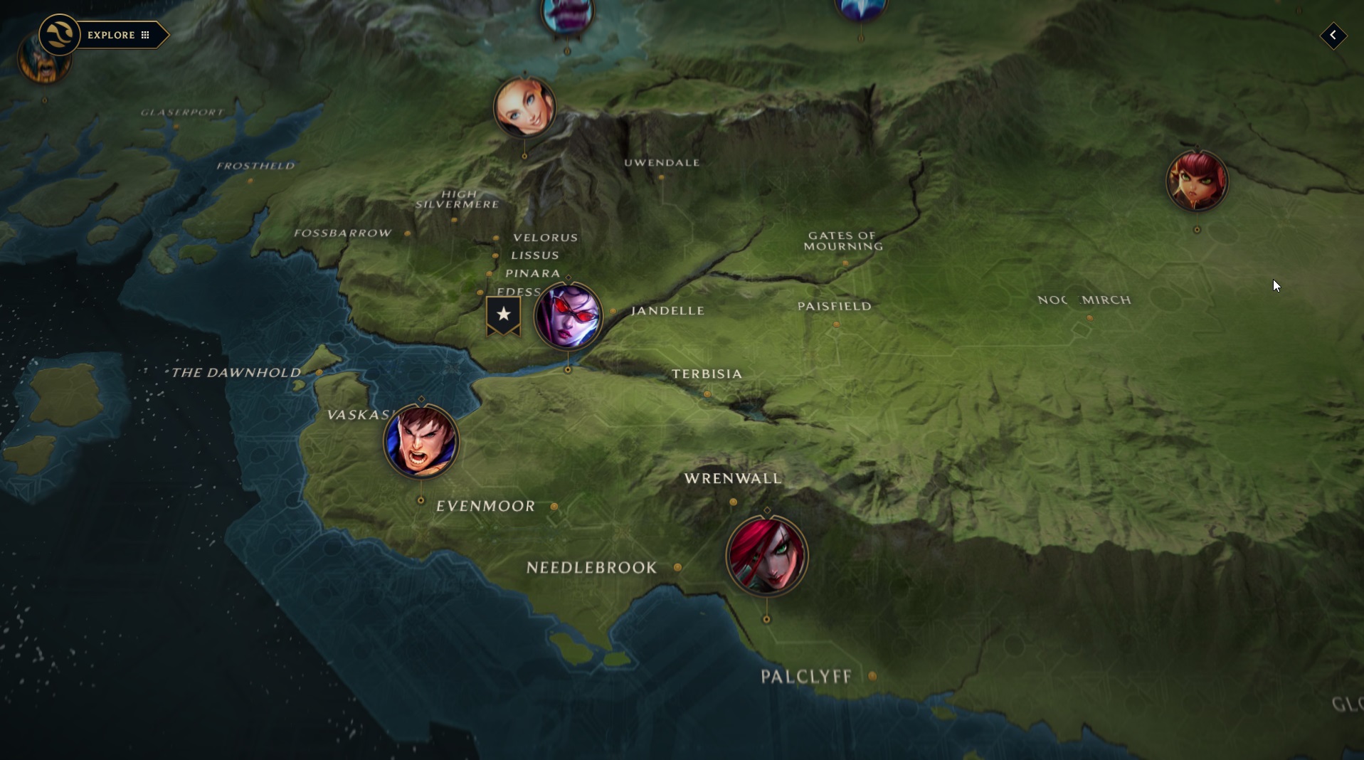
Preserving political borders at all zoom states was very important for players, as they wanted to better understand how factions interacted with each other and where their borders began and ended.
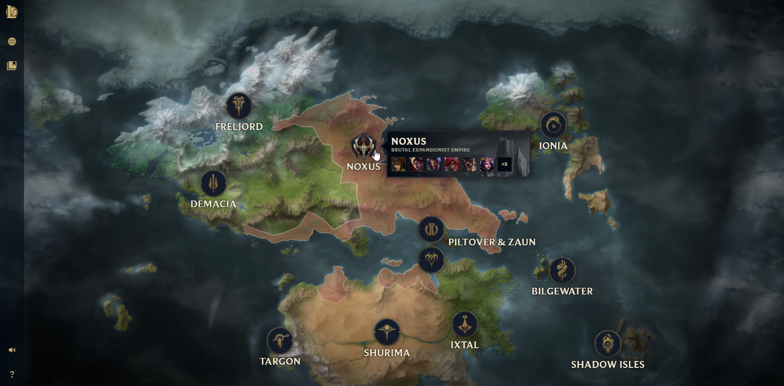
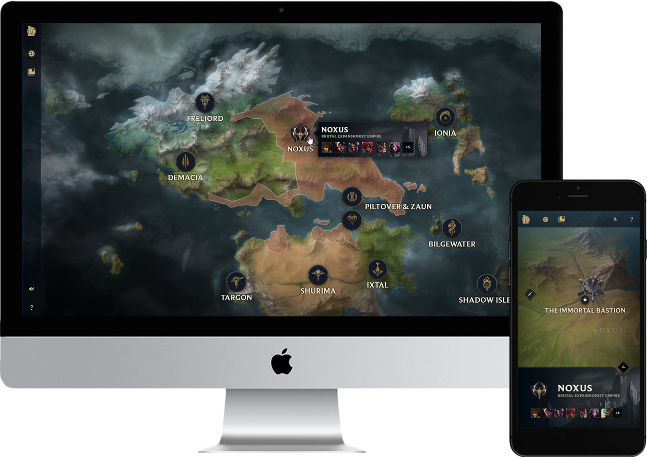
Region overlays at highest level can quickly tell players a general narrative of what’s happening in Runeterra. In this screen, players can assume that Noxus is conquering and invading all sorts of territories.

Players can also see where Noxus territory starts and ends at the closest zoom state with boundaries drawn in the map tiles.
Final Product & Results
The map had over 1 million views in the first two days, with 91% of players reporting they either liked or loved it. It was also one of the best performing launches from the Universe team.
Final Product - World View.
Final Product - Rollovers and POIs on the map.
Final Product - Image Gallery Modal.
Final Product - Mobile.
Users enjoyed the map and experienced few problems. They felt the map was visually engaging and easy to use on both desktop and mobile. General usability of interactions was satisfactory and understanding of map functions was high.
Faction borders were greatly appreciated and users really liked knowing where factions begin and end. Landmarks were a major attraction, drawing users to interact with landmarks, especially Mount Targon’s magical beam.
Additionally, art galleries were extremely valued and users were highly interested in what was contained in the art galleries, feeling they were a valuable addition to the map. Across the board, users loved and wanted more interactivity on the map.
TBSkyen shares with his viewers the new interactive map.
Remus shows his fans a closer look of the Runeterra map.